18 Feb Steal These Branding Lessons from Sabrina Carpenter and Tiffany & Co.!
In a crowded market, a distinctive brand identity can set your horse business apart and create a lasting impression. One excellent example of consistent branding comes from pop singer Sabrina Carpenter. From her pastel-blue wardrobe to her retro-1950s styling, Carpenter presents a cohesive image at every turn—whether on a red carpet, in a music video, or during live performances. The color blue she uses is no accident; it’s part of a well-crafted strategy that makes her instantly recognizable.
Tiffany Blue
Likewise, the world-famous jewelry company Tiffany & Co. employs its own unique shade, “Tiffany Blue,” to stand out. You can spot a Tiffany box from a distance—even without a logo—because that color has become an emblem of their brand. This same principle can be applied to horse farms and equestrian businesses. Imagine a stable that consistently uses a particular shade of green on its website, signage, staff uniforms, and even in show decorations. Over time, that color gains meaning and recognition, signaling the farm’s identity and values.
Semiotics
This is where semiotics—the study of signs and symbols—comes into play. Essentially, semiotics explores how we interpret visuals, words, and even sounds to form associations. A “signifier” is the physical form (such as a color swatch, logo, or even the shape of a stable’s silhouette), while the “signified” is the concept or meaning we attach to it (e.g., quality care, premium service, or a welcoming atmosphere). When it comes to horse farms, the images of well-groomed horses, pristine facilities, or a particular farm logo become a “signifier” that conveys the “signified” message: professional, caring, and dedicated.
What Will Resonate With Your Clientele
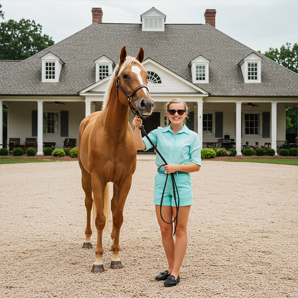
Sabrina Carpenter’s brand uses a pastel blue to signify her fun, flirty, retro persona. When audiences see that color—especially combined with vintage hairstyles or a 1950s dress silhouette—they instantly think “Sabrina Carpenter.” In the same way, horse business owners can choose a color scheme or style that resonates with their ideal clientele. Perhaps you specialize in high-end breeding programs: a sophisticated charcoal grey and silver motif might communicate elegance and exclusivity. Or, if your focus is family-friendly riding lessons, you might pick brighter, playful colors that indicate approachability and fun.
Consistency
Consistency is crucial. Just as Carpenter consistently appears in her favorite shade and vintage aesthetic, your horse farm should apply its chosen style across your signage, tack room décor, website, and social media posts. Even the tone of your messaging—whether you opt for a warm, conversational style or a more formal, refined approach—should match your overall brand image. Over time, these repeated elements become powerful signifiers that draw customers in.
Emotional Connections
A strong brand is about more than just visuals; it’s about creating emotional connections. When people see Sabrina Carpenter’s signature blue, they expect a certain vibe: lighthearted, charismatic, and slightly nostalgic. When customers see your farm’s colors, fonts, and imagery, what do you want them to feel? By thinking through the semiotics behind each choice—logo design, stable colors, marketing materials—you can shape those perceptions and forge stronger relationships.
By taking inspiration from Sabrina Carpenter’s consistent presentation and Tiffany & Co.’s instantly recognizable color palette, your horse business can establish a distinctive identity. Through strategic use of semiotics and unwavering consistency, you’ll create a memorable brand that resonates with your audience—allowing you to “own” your color or design elements just as effectively as Tiffany owns its iconic blue.